
AI product photography works best when it begins with a real product, not a wish that a model will invent the right one. A clean reference photograph gives the generation a visual anchor. Your brief then supplies the campaign direction: where the object belongs, how it should feel, and what the frame needs to accomplish.
That division of labor is why Whisk AI is useful for early campaign exploration. Its reference-remix workflow separates the product itself from the scene and the style, so a small team can change the creative direction without rewriting the whole idea from scratch. The goal is not to replace a final packshot, legal review, or physical color approval. It is to get from one product reference to several coherent visual routes quickly, then decide which route deserves production effort.
Start with the right job for AI
The strongest first use is concept development: seasonal campaign routes, landing-page hero directions, social cutdowns, or lifestyle context that would be expensive to shoot before the team agrees on the idea. Treat the output as a proposed art direction until you have checked the product details.
AI is less dependable when the image must serve as a literal catalog record. Exact label copy, ingredient claims, regulated packaging, product dimensions, and precise color matching should still come from approved source photography and the relevant review process. In other words, use Whisk AI to widen the set of visual options, not to loosen the truth of the product.
| Use Whisk AI for | Keep in your approved production workflow |
|---|---|
| Campaign concepts and seasonal mood boards | Legal copy, claims, and mandatory labels |
| Lifestyle settings and composition exploration | Exact product dimensions and color approval |
| Hero-image directions for a landing page | Catalog packshots and SKU documentation |
| Creative variants for internal review | Final assets that need compliance sign-off |
This boundary makes iteration faster. It also tells reviewers what to look at: not whether the image is a final photograph, but whether the visual route is worth pursuing.
Prepare one dependable product reference
Your product reference does not need a studio budget. It does need to make the product easy to read. Photograph the front-facing side in even light, keep the full silhouette in frame, and avoid heavy reflections that hide edges or materials. If a product has a distinctive cap, handle, seam, or label placement, capture it clearly.
Before you upload, check five details:
- The product is not cropped at the edge of the frame.
- The main color is visible without an extreme color cast.
- The product sits against a background that does not merge into its outline.
- Important packaging features are unobstructed.
- You have permission to use every image you provide as a reference.
For a range of products, begin with one hero SKU rather than uploading every variation. You are testing a visual language first. Once the lighting, composition, and audience fit are clear, repeat the workflow with approved references for the rest of the range.
Give Subject, Scene, and Style distinct jobs
The usual failure mode is asking one image to carry every instruction. A product photo becomes the object, background, lighting, and design language at once. That makes it hard to revise a campaign without losing the useful part of the first result.
In Whisk AI, use the reference slots as separate creative controls. The Subject should answer “what must be recognizable?” The Scene should answer “where is it happening?” The Style should answer “what visual treatment should guide the frame?”
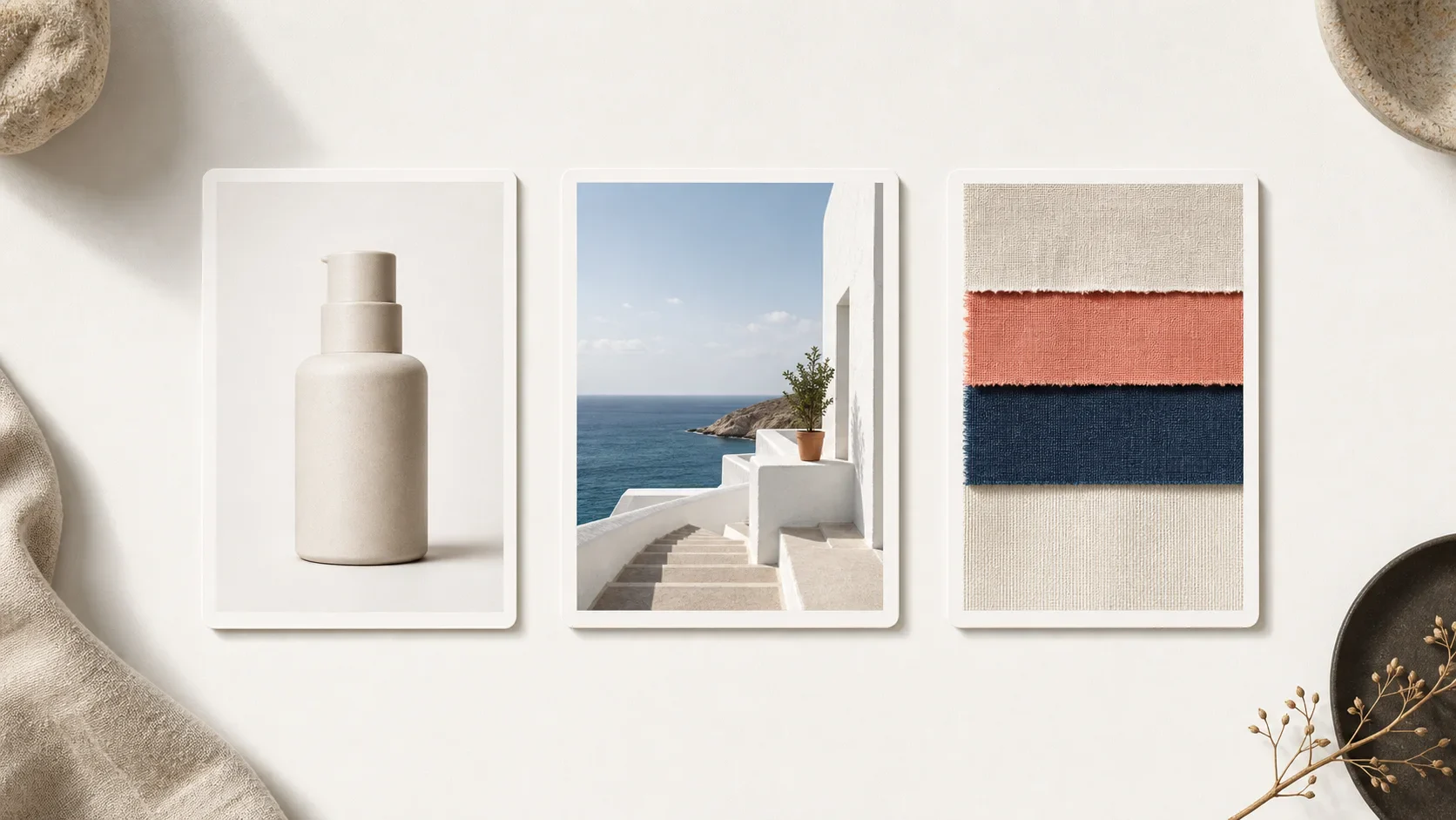
| Reference role | What to supply | What it should control | What it should not decide alone |
|---|---|---|---|
| Subject | Your clearest product image | Form, materials, recognizable features | The full campaign background |
| Scene | A location, prop, or composition cue | Setting, scale, shot context | Product identity or finish |
| Style | A visual treatment, palette, or texture cue | Light quality, tonal family, editorial feel | Literal product geometry |
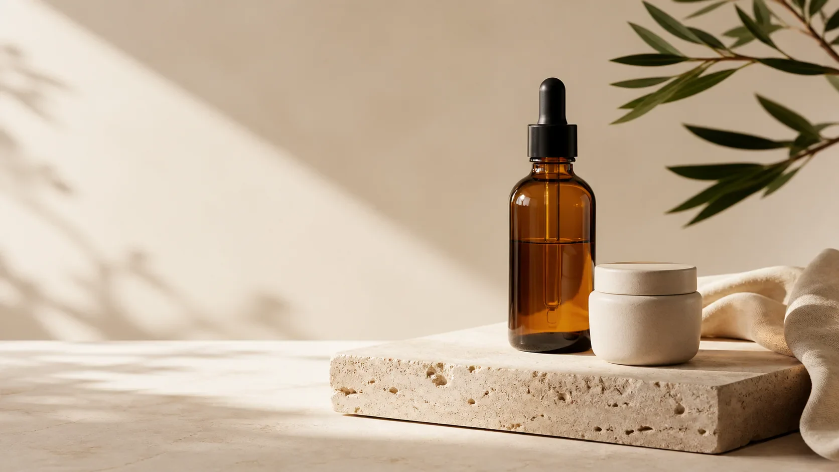
For example, a natural skincare bottle can be the Subject, a sunlit stone bathroom can be the Scene, and a quiet magazine still life can be the Style. That gives each input a clear responsibility. If the set feels too warm, replace the style reference. If the product needs a new context, replace the scene reference. You do not have to restart the entire brief.
Write a brief that protects the important details
References carry visual information, but the prompt should still state the decisions that determine success. A useful product-photography prompt is compact and ordered:
- Say what must remain recognizable about the product.
- Name the campaign situation or audience moment.
- Describe the composition and camera distance.
- Set the light, palette, and level of restraint.
- State what to avoid when it matters.
Here is a starting structure you can adapt in the Whisk AI workspace:
Keep the product silhouette, amber glass, black dropper, and simple ceramic companion recognizable. Place it in a quiet morning skincare routine on pale stone, with soft directional window light and restrained editorial styling. Use a wide landscape composition with clear negative space on the left for campaign copy. Avoid extra packaging, visible words, and dramatic reflections.
The final sentence is not a magic safety switch. It simply reduces ambiguity. If a particular visual feature matters, name it before you start generating variations.
Use a single-variable iteration loop
After the first generation, do not change every input at once. Choose the weakest decision and adjust only that: the scene, the style, the framing, or the prompt. Saving that discipline makes comparison meaningful. You can tell whether a darker background improved the product focus instead of wondering which of six changes caused the difference.
An efficient review loop looks like this:
- Generate three to five routes from the same product reference.
- Pick one route with a strong product read and one with a strong atmosphere.
- Keep the Subject fixed, then revise the Scene or Style for each route.
- Compare the next round side by side using the same review criteria.
- Promote only the winning direction into a final production brief.
Review like an art director, not a prompt collector
The image can feel polished while still failing the job. Review the output at full size and compare it with the source reference. Product accuracy matters more than novelty when the visual will represent something people can buy.
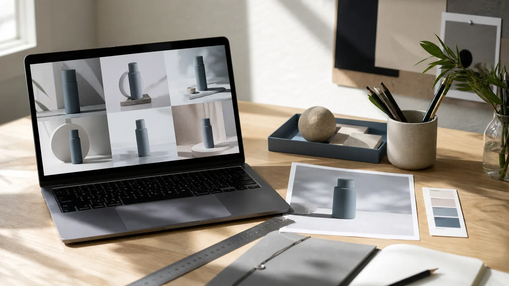
Use this short review table before you share a route with stakeholders:
| Review question | Pass condition | Common signal to regenerate |
|---|---|---|
| Is the product recognizable? | Shape, material, and major features still read correctly | A cap, handle, seam, or silhouette changes |
| Is the product the focal point? | The eye lands on it quickly at thumbnail size | Props or scenery compete with it |
| Does the light support the material? | Glass, fabric, metal, or paper looks believable enough for the concept | Highlights, shadows, or reflections feel incoherent |
| Does the scene fit the audience? | The setting adds a clear campaign idea | The scene is generic or conflicts with the brand tone |
| Is there a usable layout? | The crop leaves room for the intended headline or CTA | The frame is crowded or crops the product awkwardly |
When a route fails, diagnose the failure before you prompt again. A wrong silhouette is usually a Subject problem. An implausible environment is usually a Scene problem. A beautiful but off-brand image is usually a Style problem. That simple diagnosis keeps the next change deliberate.
Turn a winning direction into a production brief
Once a route works, capture the decisions that made it work. Save the product reference, the selected scene and style references, the final prompt, the crop, and the review notes. Then write a short handoff for the designer, photographer, or editor who will carry it forward.
Your brief can be one page:
- Audience and message: who should feel addressed, and what the image needs to communicate.
- Product truth: the source asset and the features that must not change.
- Visual direction: the approved composition, palette, material treatment, and mood.
- Layout constraints: orientation, negative space, and channels where the asset will appear.
- Approval boundary: what still requires product, legal, or brand review.
This is where AI becomes useful beyond a single image. It helps the team make an aesthetic decision visible and discussable. The result is not “a prompt we liked”; it is a creative direction with enough structure to execute consistently.
A practical first campaign exercise
Choose one product and create three campaign directions: a clean studio route, a lifestyle route, and a seasonal route. Keep the product reference fixed across all three. For each route, change only the Scene and Style inputs, then use the same five review questions.
You will quickly see whether your product needs a calmer environment, more negative space, stronger material contrast, or a more specific audience context. That learning is reusable across future launches. When you are ready to explore the next direction, start in the Whisk AI workspace and keep the first reference set intentionally small.
Frequently asked questions
Can I use AI product photography as my final ecommerce image?
Use it according to your brand, marketplace, and legal requirements. For product truth, mandatory labels, and exact color or dimension claims, rely on approved source assets and the appropriate review process.
How many reference images should I start with?
Start with one product reference and add a scene or style reference only when it answers a distinct creative question. Fewer, clearer inputs make it easier to understand why a result changed.
What should I do when the product shape changes?
Return to the clearest product reference, make the important physical features explicit in the prompt, and simplify the Scene or Style input. If the exact geometry is non-negotiable, use the approved product photograph instead of treating a generated image as the source of truth.
How do I make a set of campaign images feel consistent?
Keep the Subject reference and review criteria stable. Then reuse a small approved family of scene and style directions rather than inventing every image from a blank prompt.